Fixing the broken state of
Environmental Testing
Environmental testing has long been the most painful part of food production workflows—slow, disconnected, and prone to error. Legacy systems rely on static reports, manual data entry, and fragmented communication between QA, lab, and operations teams. Staying compliant is hard, and collaboration across teams is even harder.

Team
Itisha Srivastava
Harshita Shenoy
Tools
Figma
Lovable (AI Frontend)
Jitter
Maze
Roles
Researcher
UI & Motion Design
UX Design
Strategy Design
Cloud-based SaaS platform
ESV : Eat Safe Verified
ESV is a cloud based SaaS platform by Genista Biosciences revolutionizing food safety testing and tracking for the CPG and co-manufacturing industries. It provides a centralized solution for streamlined processes, fostering collaboration, real-time communication and automated corrective actions. It integrates manufacturing execution, quality assurance, environmental compliance, product testing, and supply chain management, enabling end-to-end operational visibility and optimization for food manufacturers.
_edited.jpg)

Pain Points and Opportunities
Clustered Themes
Research & Discovery
Alongside our CMS teams, we met with QA managers, lab technicians, sanitation leads, and compliance officers across multiple food production sites. Our goal was simple:
We wanted to know
Understand what their day for each role actually looks like
Routine Map
We shadowed their workflows, mapped their routines
Tool Analysis
Digital and physical tools they rely on (or avoid)
Identifying problems
Used contextual inquiry and workflow audits to surface key usability gaps and system friction points.
What we FOUND
01
Scattered Processes, Disconnected People
Problem
Environmental testing was a fragmented process. Data lived in spreadsheets, emails, printed maps—and sometimes scattered in various softwares. People used physical pins to mark where swabs had been collected on facility blueprints. If the paper got lost or smudged, so did the record. There was no shared system of truth.
“Sometimes we don’t even know if a swab was missed until a recall happens.”
Insight
We needed to digitilize mapping and tracking, and make environmental test zones visually accessible and easy to update without relying on memory or paper trails. Enable smooth data integration across external systems
02
New Team Member Every Day
Problem
Food production teams often rotate responsibilities. A different person might be in charge of testing each day, many of them temporary or new employees. There was no onboarding or guidance system—just tribal knowledge and scattered notes.
“It’s never the same person two days in a row.”
Insight
We had to build a UI that didn’t assume prior knowledge. The interface needed to greet every user—new or returning—with clear tasks for the day, alerts, context, and progress tracking. ESV Environment had to become self-explanatory
03
Tool Fatigue and Low Adoption
Problem
Some teams were barely using ESV at all. We realized the problem wasn’t lack of functionality—it was lack of motivation and usability. Users didn’t feel like ESV helped them work faster or more confidently. If a platform doesn't make their life easier from Day One, they’ll default to whatever system requires less thought.
“Honestly, we just don’t use it unless someone tells us to.”
Insight
Improving user satisfaction and increasing adoption became just as critical as shipping features. We introduced engagement-focused features like smart notifications, cleaner navigation, and personalization to increase daily active use. Internally, we began tracking User Satisfaction Scores (USS) and Feature Activation Rates as key product metrics.
04
No One Workflow Fits All
Problem
One of the first surprises we ran into was how differently every business handles environmental testing. Some teams were already using third-party software to manage swab data and historical logs. Meanwhile, they used ESV for everything else—QA, product testing, team ops. The disconnect meant redundant work, mismatched records, and user fatigue.
“We already use [X software] for this part—do we really have to start from scratch?
Insight
Rather than forcing clients to abandon their tools, we built import functionality that allowed them to migrate or sync their existing data into ESV. Whether it was Excel files or exports from another system, we created translation pipelines that kept their progress intact. Each client was also assigned a dedicated QA Manager who guided setup and ensured a smooth transition.
05
Manual Planning Slowed Response and Increased Risk
Problem
Manual planning led to missed tests and delayed responses. Teams lacked tools to prioritize high-risk areas based on real data. The result was a reactive workflow that couldn’t keep up with contamination risks.
“ We need the system to think ahead—test plans shouldn’t depend on us remembering.”
Insight
We used AI to automate test plans and trigger corrective actions. The system now factors in risk levels, contamination history, and zone sensitivity—auto-scheduling tasks and helping teams act faster. This transformed the testing process from memory-based to model-driven.
06
Custom Workflows, Real Support
Problem
Across clients, one thing became clear: environmental testing isn't one-size-fits-all. Every site had its quirks—different protocols, frequencies, shift handovers, reporting needs. Some wanted more automation; others needed tighter manual controls. And everyone needed help onboarding their team.
"This plant works differently. Can we tweak that step?”
Insight
ESV Environment was built to be flexible. We created customizable workflows, optional modules, and toggles that let each site adjust the platform to their reality. And with every rollout, we assigned a dedicated QA Manager who helped clients set up the system, onboard their team, and align the product to their exact needs. That’s how we turned ESV from “just another tool” into a trusted operational partner.
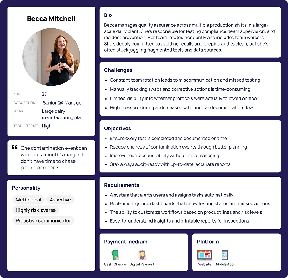
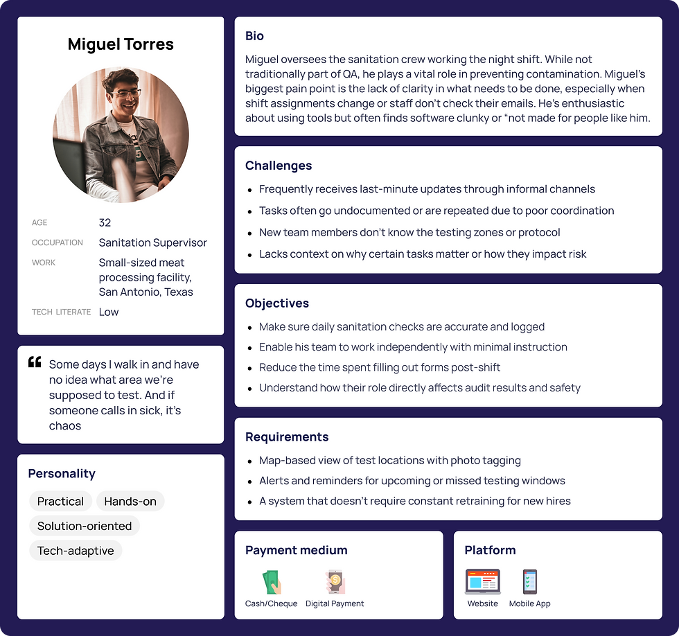
User Personas
Understanding different buisness needs
.png)
.png)
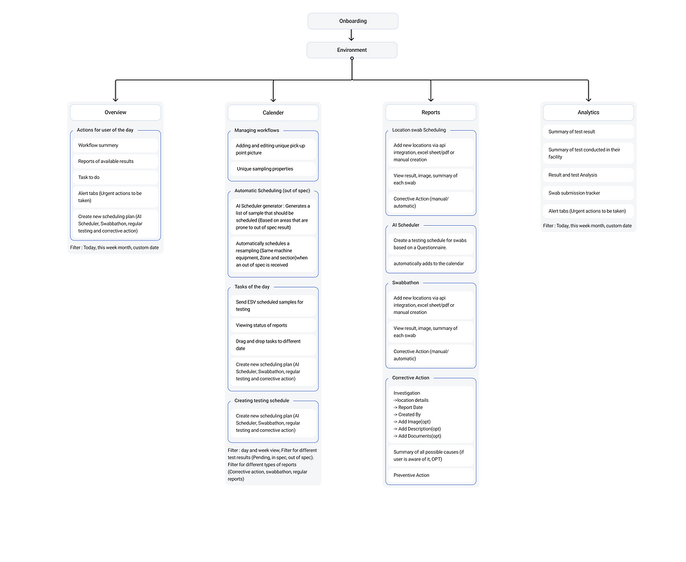
Information Acrhitechture
Creating the Envionment Feature
.png)

Centralized & Scalable
Replaces scattered, manual workflows with a unified platform built to scale with any facility’s size and complexity.

Custom Workflows & Dedicated Support
Every site runs differently—so we offers flexible workflows, adjustable modules, and a dedicated QA Manager to tailor the setup, onboard teams, and adapt to each client’s unique protocols.

AI-Assisted Planning & Smart Scheduling
Uses AI to build dynamic, risk-based testing schedules—saving time, reducing human error, and boosting confidence in coverage.

Automated Testing & Real-Time Integrity
Automates testing tasks and keeps all data synced instantly, ensuring teams act on the most up-to-date information.
Our Features
Smarter, Safer, Streamlined
The Environment module within ESV replaces outdated, manual workflows with a smart, centralized system built for scale. It automates testing processes, ensures real-time data integrity, and streamlines operations through role-based access, cloud storage, and seamless API integrations.
Wireframes
Creating the Envionment Feature
1. Overview Dashboard
.png)
Initial Wireframe: Information Silos & Lack of Hierarchy
-
Issue: Early wireframes displayed data in isolated cards without a clear visual hierarchy or flow, making it hard for users to understand what needed immediate attention.
-
Takeaway: Users needed a prioritized, glanceable overview, not just a data dump.
.png)

Iterations: Overloaded Interface & Cognitive Load
-
Issue: In the first design iteration, all modules—workflow, alerts, results, and sampling—were crammed together with minimal grouping, creating decision fatigue.
-
UI Flaw: Lack of grouping logic and visual anchors (icons, section headers, color cues) made scanning difficult.
-
Fix: We adopted clear spatial zoning (left-to-right priority flow), aligned with how users naturally scan screens (F-pattern).
.png)
Final UI Design
-
Prioritized Layout: Clean, left-to-right hierarchy with clear zoning for tasks, alerts, and results—aligned to how users scan information.
-
Quick Selections Panel: High-frequency actions like AI Planning and Swabathons are surfaced upfront for immediate access.
-
Real-Time Feedback: Auto-refreshing status indicators and microinteractions help users stay updated without extra clicks.
-
Smart Alerts: Critical issues are visually flagged using color-coded badges and typographic emphasis for faster recognition.
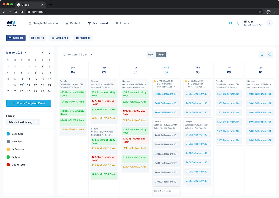
2. Calender
.png)
Initial Wireframe: Calendar Without Context
Issue: The early wireframe presented the calendar as a grid of color blocks without showing essential context like room location, submission type, or sample count. Users were forced to click into each item to get basic information, slowing down planning and task execution.
Takeaway: Calendars aren’t just about dates—they're decision tools. Users needed contextual details surfaced upfront to prioritize actions without excessive clicks.
.png)
Iteration 1: Overcrowded Cards & Hidden Actions
Issue: Cards were overloaded with data and stacked tightly, while key actions like filtering or event creation were hard to find.
Takeaway: Users needed clearer hierarchy, whitespace, and surface-level controls to reduce friction on busy days.
.png)
Final UI Design : Context-Rich & Actionable Calendar
Adoption of UI Guidelines: Applied Material Design for clear card structure, added mini-calendar for quick jumps, and ensured color accessibility for status tags.
Resolution: Cards now show key info upfront (location, type, status), filters are persistent, and a “+ Create Sampling Event” button is always visible—making the calendar both informative and interactive.
3. Reports
.png)
Initial Wireframe: Functional Blocks, But No Narrative
Issue: The wireframe mapped key zones like metadata, maps, and tables, but the layout lacked a cohesive flow. It felt like disconnected widgets rather than a reporting experience.
Takeaway: Users needed a narrative—from search to insight—not just components. The layout had to guide users through report exploration and action

Iteration 1: Overloaded Layout & Action Uncertainty
Issue: The first design iteration presented too much at once—map pins, metadata, test results, filters—without indicating what was primary or next. Actions like scheduling or editing specs were hidden in corners.
UI Flaw: No clear hierarchy or progressive disclosure made the experience overwhelming, especially for new users reviewing test results for the first time
Fix: Refined zoning, introduced tabbed views (Regular vs. Corrective Action), and added visual anchors like test dates and download buttons upfront.
.png)
Final UI: Streamlined, Modular & Actionable
UI Guidelines Followed: Applied Material Design for structure, ensured color contrast for status tags, and used Nielsen’s heuristics for visibility and recognition.
Fixes:
-
Tabbed views for Regular vs. Corrective reports
-
Clear action buttons (download, edit, corrective)
-
Left panel for swab history
-
In-line results with color-coded specs
Outcome: Users could now explore, act, and download insights without leaving the report view.
4. Analytics
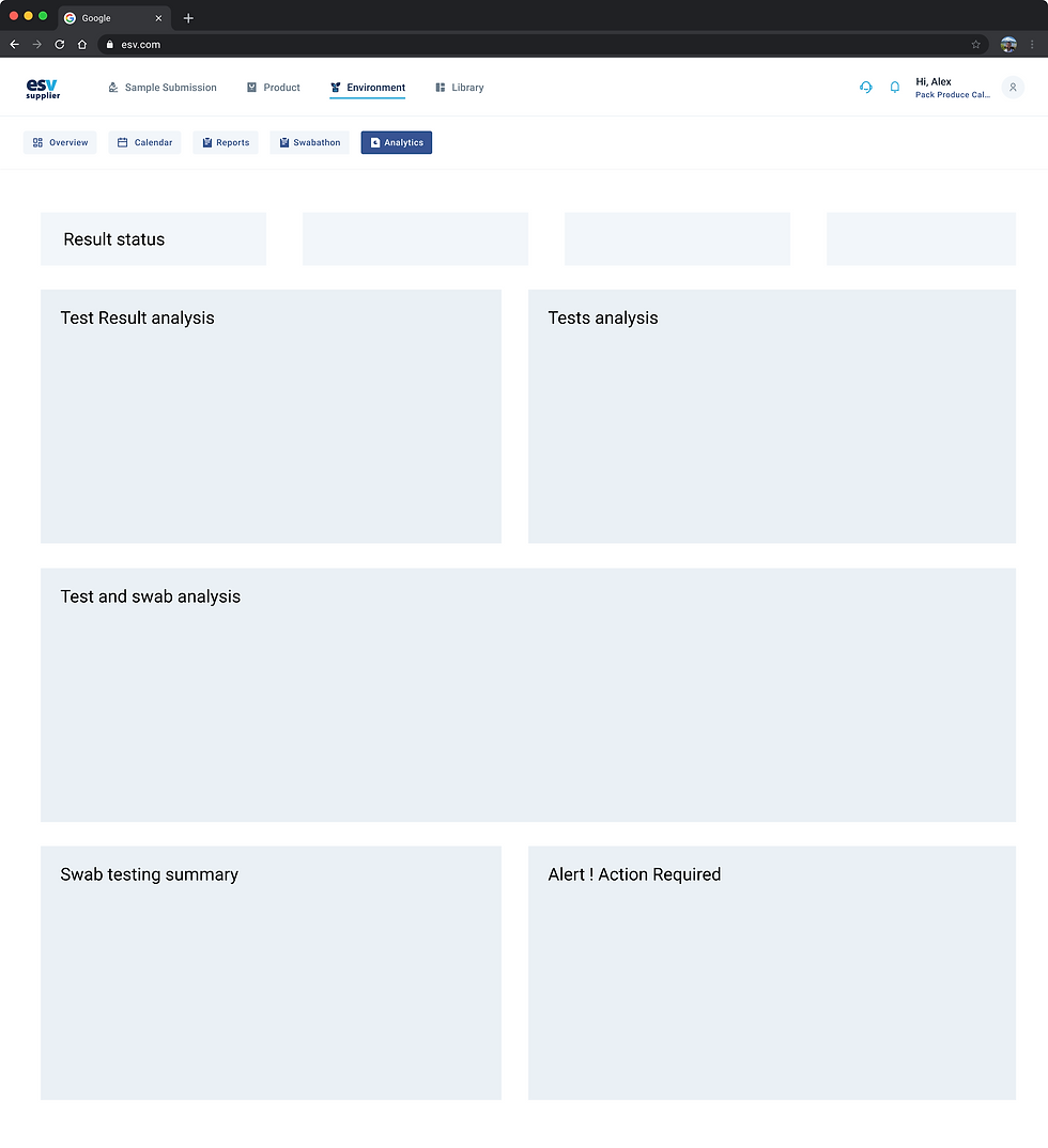.png)
Initial Wireframe: Generic Grid Without Insight Flow
Issue: The wireframe presented placeholders for charts and summaries without clear grouping or flow, making it hard to interpret what insights would be shown or where users should focus.
Takeaway: Analytics needs a narrative hierarchy—users must immediately grasp what’s urgent, what’s trending, and where action is needed.
_edited.jpg)
Final UI: Interactive, Insight-Driven Dashboards
-
Applied Gestalt principles to group related data (volume + result status).
-
Used color theory and data viz best practices for intuitive charting (bar graphs, progress bars).
-
Followed Jakob’s Law—aligned with familiar dashboard conventions for faster learnability.
Resolution: -
Added filters for building, zone, section, swab number
-
Used chips and legends for test types
-
Enabled export, time range selection, and volume-to-result mapping
Outcome: Users could now explore trends, spot risk zones, and act on alerts—all from a single screen.
Turning Insight Into Interfaces

Information architecture
.jpg)
UX Key Features
AI-generated alerts that prompt daily actions based on risk and task priority.
Quick-access buttons let users create new schedules or tasks instantly, view results and other updates
Shows tasks, flags bottlenecks, and prompts timely action to keep workflows smooth.
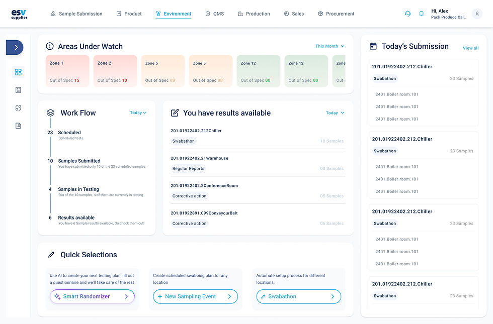
Overview main screens
.png)
Overview Dashboard (Main screen)
.png)
Areas under watch : Critical zone
.png)
Creating new plan using AI
.png)
Tasks for the day
Overview Prototype

Overview Panel
Making the First Click Count
Every team member starts here — the personalised Overview acts as their daily command center. In high-turnover sites, this reduces confusion and missed tasks by clearly showing today’s testing plan, result alerts, and any actions that need attention.
Information architecture
.png)
UX Key Features
Syncs with all testing plans and auto-assigns roles. Sends real-time notifications for test completion, result updates, or action required.
Adding and editing unique pick-up point picture , unique sampling properties and sampling point location in one’s facility
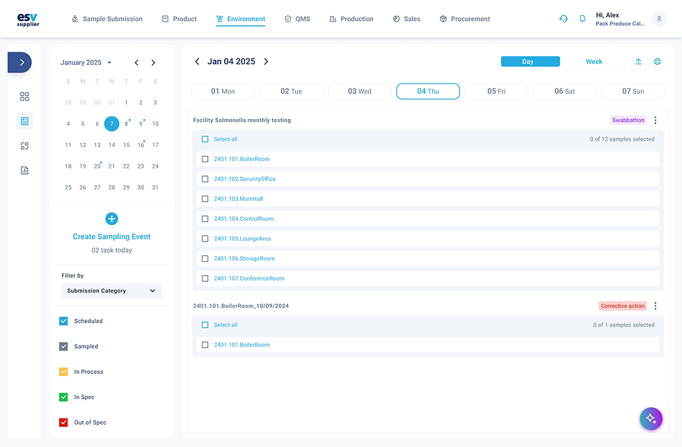
Automatic scheduling of swab when an Out of spec result occurs
Calendar main screens
.png)
Calendar (Week view)
.png)
Submitting samples to ESV and printing labels
.png)
Calendar (Day view)
.png)
Creating new testing plans
Calendar Prototype
Calendar
One Space, Shared by All
Teams lacked a shared workspace, creating duplicate efforts and missed tasks.
We introduced a drag-and-drop calendar view that does the following
Information architecture
.png)
UX Key Features
Testing plans are equipped with progress bars so users always know how many steps remain. Autosave + smart field prediction based on past user behavior
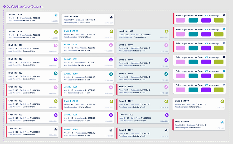
Digital facility maps that sync with testing data. Interactive pins that dynamically update based on contamination results. Helps user understand spread of contamination
Corrective action plans for positive results. Includes documentation of events, root-cause analysis, preventive measures for the future etc.
Reports main screens
.png)
Reports and Facility map
.png)
Swab Report
.png)
Corrective Action
.png)
Importing new swabs
.png)
Creating new plan using AI
Reports Prototype

Smart Testing
Designed for Every Scenario
Testing didn’t look the same across teams—or even across weeks. Some users needed daily swabs at standard locations. Others wanted deep inspections after incidents. Many had no
structured plan at all.
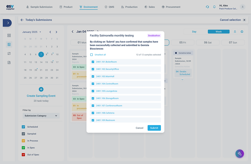
We created three flexible testing modes:
-
AI Plan Generator : A guided plan creation based on answers to a few operational questions
-
Location-Based Testing : Regular swabs by zone, with corrective action flows built in
-
Swabbathon : A bulk testing mode for full facility sweeps (40+ swabs)
UX Key Features
Designed insight-first analytics dashboards that interpret trends automatically.
Smart summaries (e.g. “Contamination spike in zone 4 last week”). Suggests corrective actions based on test outcomes
Export-ready compliance logs for audits and inspections.
Analytics Prototype

Analytics
From Reactive to Predictive
The Analytics dashboard centralizes insights: contamination risk heatmaps, trends by pathogen type, zones with delayed action, and more. It even suggests corrective actions based on past incidents and recommends retest intervals. Graph-heavy interfaces confused users and made insight extraction difficult.
Engineering Handoff
Interactive Prototypes
.png)
All core user flows were documented with high-fidelity prototypes, capturing intended interactions and transitions
Edge Case Coverage
.png)
Scenarios beyond the happy path—including errors, empty states, and alternate flows—were clearly designed and annotated
Component System
.png)
We shared a clean, scalable component library with detailed variants, states, and usage rules to support efficient development.
Release Notes
.png)
Each design file was accompanied by clear release documentation, outlining user stories, functionality specs, and any conditional logic
Design Audits
.png)
Post-development audits were conducted to ensure alignment with the intended experience and polish for final delivery
Lovable AI Integration
.png)
The final designs were also built in Lovable AI as interactive front-end mockups, enabling early user feedback before backend integration
Us In Numbers
Post-launch, we saw meaningful adoption signals. Our future plans include:
-
Smarter Scheduling : Enhance our AI planner to predict high-risk zones before issues surface.
-
Lab & IoT Integration : Connect ESV with lab instruments and sensors for real-time data flow.
-
Full Workflow Sync : Align Environment with QA, Budgeting, and Logistics for end-to-end traceability.
-
Impact Dashboards : Equip leadership with analytics that tie testing data to business value.
-
UX Nudges : Reinforce habits through contextual tips, adaptive UI, and proactive alerts.
The path forward isn’t just about adding features—it’s about deepening the system’s intelligence and making food safety a seamless, integrated part of everyday operations.
83
User Satisfaction Score (USS)
Users reported clear workflows and reduced friction
55%
Activation Rate
Within the first week validating ease of onboarding.
71%
30-day Retention
Showing users were coming back and relying on it.
40%